Inspired To Get In Touch
Inside The Business Of Emotional Marketing
Last year, PPAI launched its Get In Touch! campaign, a five-year, multimillion-dollar, industry-wide initiative encouraging advertising buyers to recognize the power of promotional products and to allocate a larger share of their marketing dollars to the promotional products industry.
How do we, as practitioners, fulfill that mission? Through our daily work in the promotional products industry, have we lost touch with how crucial our medium is for conveying emotion? How do we ensure we build campaigns that “get in touch”?
At the recent skucon conference (an annual educational experience for industry entrepreneurs held concurrent with the The PPAI Expo in Las Vegas), distributor and supplier attendees became our use case for the power of promotional products and the Get In Touch! initiative. Our medium, when treated as a vehicle for conveying emotion, becomes much more than products, and an entire promotional campaign can fulfill a passionate purpose.
Many of us have had it wrong for years. We’re not in the promotional marketing business at all; we’re in the emotional marketing business.
As attendees (distributors and suppliers) received their bags of promotional products at skucon, we heard:
“Love!”
“Super cool!”
“Perfection.”
“On point.”
“Stylish.”
“Swag worth stealing!”
Starbucks’s Howard Schultz wrote a stunning admission in his autobiographical memoir, Onward: How Starbucks Fought For Its Life Without Losing Its Soul. He said the real value of their brand wasn’t coffee: “Starbucks’ coffee is exceptional ... but emotional connection is our true value proposition.” For those skeptics who refuse to believe, Schultz continued, “emotional connection” is “a subtle concept, often too subtle for many businesspeople to replicate or cynics to appreciate.”
All buying decisions (all!) are made emotionally and justified rationally. From the vice president of marketing who decides on a multimillion-dollar promotional budget to your decision about the last car you bought: if you mapped the emotional journey of your decision-making process, you would discover that you made an emotional decision and justified it with reason.
When it comes to building campaigns, particularly our own campaigns, we must map everything we sell to an emotion. (If it is good enough for $19 billion Starbucks, then it should be good enough for us, too).
The promotional products at skucon provide a unique case study into this process, as we have feedback from all attendees involved. We have the customer (commonsku) working with the distributor (RIGHTSLEEVE) who worked through their supplier partners: RuMe Brandsuite, SanMar, Hit Promotional Products, Redwood Classics, Gemline, BamBams, Maple Ridge, EMT, iClick, NEXT Products, YourCo (A T-Shirt Tycoon Solution), SnugZ USA and Clearmount.
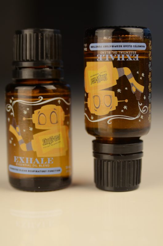
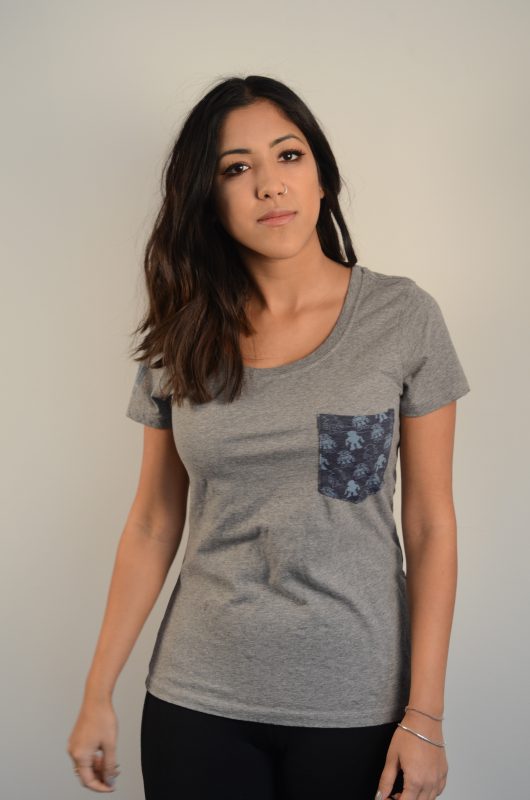
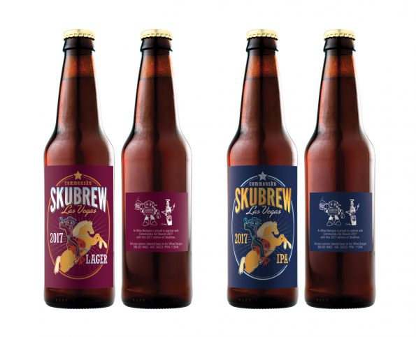
Products selected for skucon attendees included the custom-packaged brew, essential oils and an iconic pocket tee pictured below.


When we at commonsku sat down with RIGHTSLEEVE, the distributor, to talk about product at skucon, what we worked toward was the answer to this question: What emotion do we want to evoke in the hearts and minds of our customers?
The answer was one word: Inspire.
Everything from the product selection to the artwork and design, to the imprint styles, to the distribution of product at the event, was tailored with the emotional imperative: Inspire our audience. (Even the event was held at the Inspire Theatre in Las Vegas).
But, to truly electrify with emotion, our vision had to be shaped into something tangible, a conduit. Take the skucon t-shirt, for example. We wanted an iconic piece that would become both inspirational and aspirational for attendees. We conferred with Lauchlin Burnett and Stephen Musgrave, both directors at RIGHTSLEEVE who, working with designer Tee Hamilton, set out to tackle the ambitious task. Not only would we need to create a memorable item but we also had to impress the experts—our attendees—which meant producing something extraordinary.
We started with design first. Design is the first emotional touchpoint that catches the recipient’s eye. Design is what drives most of our product decisions.
We’re also firm believers in the idea that creativity is not limited to the sphere of originality; creativity is being adaptive. Creativity is not the origination of ideas. Ingenuity—adapting ideas—sparks inspired thinking. We came up with the idea to take a stock shirt from SanMar and adapt it to our design preferences by partnering with our friends at T-Shirt Tycoon.
We knew that pocket tees are on trend these days and they also appeal to both men and women, so we came up with an idea for a pocket tee with an all-over print on the pocket.
We loved the idea of this product because there’s an element of custom manufacturing that separates this from the regular stock shirt. We knew that our audience—all t-shirt geeks themselves—would ask how they were made. And with questions, come the opportunity for storytelling; it’s exactly the moment we crave as people who sell promotional products for a living.
We also chose to privately label the shirts to showcase the commonsku brand (as well as the brand of our partners in the production process, SanMar and T-shirt Tycoon).
Since we were going to be working with T-shirt Tycoon to private label the shirts, we had to pick a style that would work well with their process and a style that would work for our audience. We wanted a fashion-forward style that could also act as a classic go-to piece in the recipient’s drawer. We decided on a slimmer cut for the men’s shirt and a looser fit for the women. We had done slimmer cuts for women in the past but received feedback that preferences had shifted towards looser, more comfortable, flattering silhouettes for women. We opted for the Men’s DT6000 in Heather Charcoal (50/50 blend) and the DM106L in Heathered Nickel. Both shirts gave us more control over shrinkage (due to the poly blend) after the shirts had been decorated.
Next came the difficult part: cutting a pocket and applying it to a stock shirt. To achieve the allover print, we needed to print onto a bolt of fabric and then cut out the pocket and apply it to the shirt. Since we were working with a stock shirt, we needed to order white XXL shirts that could be cut up into little pockets; this resulted in an exact fabric match when sewn onto the shirt. Ordering them in white also made the discharge printing easy.
Adam and Brittany Walterscheid and their team at T-Shirt Tycoon then went to work and produced some magic with the pockets. Now that we knew we could pull off the pockets, we brainstormed some pocket design ideas. We wanted to produce something with a step and repeat pattern as we felt that would work best for the allover print. We also elected not to print anything else on the front of the shirt as we wanted the pocket to stand alone.
From a branding perspective, we chose to print our brand name on the sleeve. It works nicely with the discharge printing because it sinks right into the fabric, so it’s not too “in your face.”
We also produced a video of the shirts being decorated and made it accessible to recipients so they could see firsthand how the garment was produced. Instead of printing the QR code on the sleeve (lame promo alert!) we chose to print it on the inside bottom corner of the shirt so it would not be visible to others.
We were really pleased with the result. It took a lot of time and care to produce something that we were proud to distribute to skucon attendees.
When the t-shirt project was discussed with RIGHTSLEEVE and with our supplier partners, we never strayed from using the language of emotion. We told our partners, “We want to inspire our audience.” Though it was important to walk through specifics, the suppliers were brought into the story and not merely the project. Brittany Walterscheid said that RIGHTSLEEVE, “came in with big ideas and a big vision of how they pictured their brand through apparel.”
To achieve something extraordinary, collaborators must sense a larger vision, and they can only do this when we share details of our vision. Twyla Tharp, the celebrated dance choreographer, in her book The Collaborative Habit, wrote that “a clearly stated and consciously shared purpose is the foundation of great collaborations.”
And it’s more than just product. We should never just spec an item with our partners when we’re building significant campaigns; we should share the vision of how we want the product to drive the emotional experience. Tharp phrased it this way, “Everything and everyone matters. There are no ‘details.’”
Because of this, T-Shirt Tycoon was able to help shape the design decision while respecting the vision and consciously sharing the purpose. “By collaborating with RIGHTSLEEVE and understanding what commonsku’s ultimate goals were, we used up every part of that shirt … and it was great to see the end user celebrate the product,” Walterscheid adds.
Beyond the t-shirt, we felt it was crucial to carry this idea of differentiating by design and evoking emotion through to every product we produced for the conference. Rather than just dropping the commonsku logo on items, we saw each product as a blank canvas and that every promotional item had a purpose.
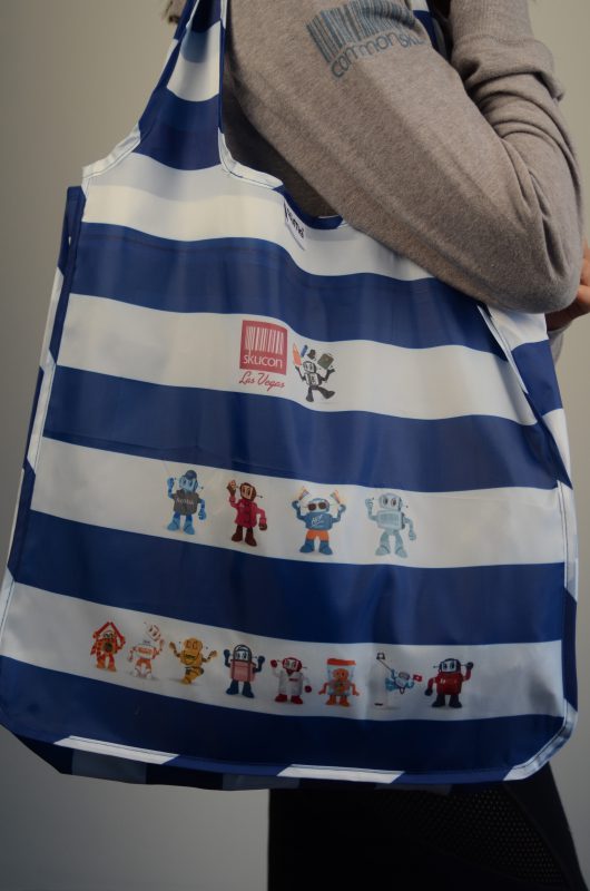
We created custom “no pair is the same” mitts from Redwood Classics, and unique, custom socks with BamBams. When attendees arrived, we wanted them to connect with their ‘tribe’ so we designed trendy patches through EMT featuring a variety of roles that attendees would identify with (operations, entrepreneur, creative, sales, marketing). So many of our customers say they are fans and they love to collect skubot gear (items with the skucon logo), so we created limited-edition items like our plush skubot through Hit, skubot powerbanks through iClick, SIGG bottles, and on our stylish bags  from RuMe Brandsuite, we printed the custom icons of each of our supplier partners’ logos. To top it all off, we had treats for body and soul: delectable goodies from Maple Ridge Farms, skubrew (the official beer of skucon) from A+ Wine Designs, and essential oils from SnugZ USA. For each of our partners, we also created custom logos with skubot that celebrated the uniqueness of each of their lines.
Product plus good design communicates emotion (whimsy, fun, excitement, relief, joy). By treating each product as a blank canvas and crafting the design on every product, we mirrored the purpose (inspiration) and sparked a strong emotional bond with the recipient.
PPAI’s Get In Touch! campaign emphasizes that promotional products are “advertising that lives on.” The play on the language is perfect: “Advertising that lives on” expresses both the longevity of the message as well as the emotional response by the recipient: they cherish the items they receive which then become the advertising that (literally) lives on as buyers adopt the gear as their favorite hoodie or water bottle.
The campaign also emphasizes that the products we sell are the vehicle through which an emotional connection occurs as we “touch the hearts of consumers.”
This means it’s about much more than just a product. If emotional connection is the value proposition in a commodity like coffee, then surely the customized experiences that we craft together (that generate surprise and delight to our audiences) are enough to encourage buyers to allocate a larger share of their marketing dollars to promotional products.
Design and purpose determines product selection and heightens the emotional experience of every campaign we create. When we see a product as just a product, rather than a vehicle through which magic can happen, then “stuff we all get” is noise; “swag we love” is the signal.
The result? Pure inspiration.
Bobby Lehew, CAS, is chief content officer at commonsku. Reach him at bobby@commonsku.com.

